One product, two readers, and only one of them gets the defaults
Bookflow is a reading and listening app for students who need throughput and dyslexic readers who need access. I built it alone, and gave the defaults to one audience and the ceiling to the other.
I designed and built Bookflow alone. The hardest decision in it was which of its two users the defaults belong to.
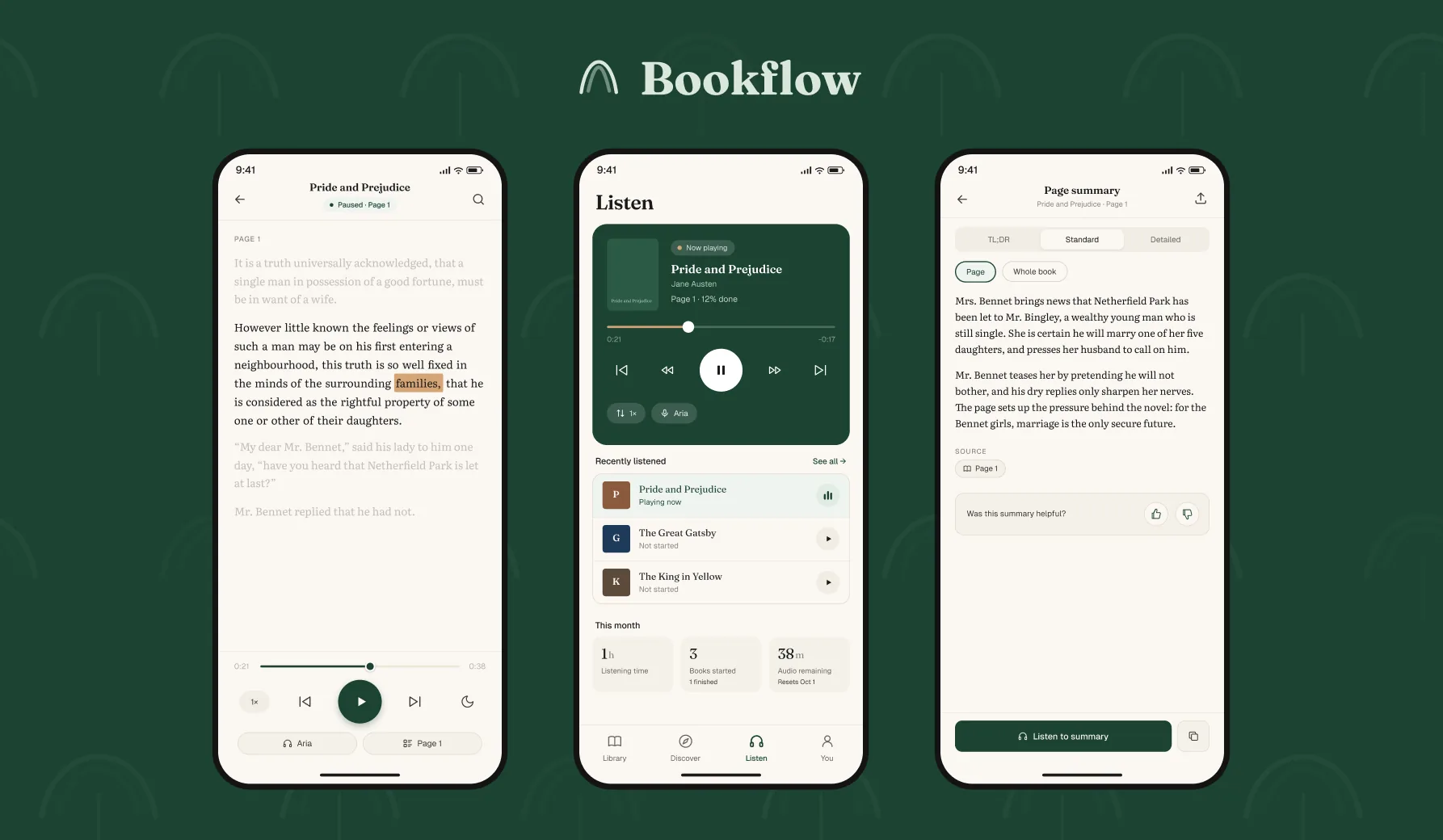
Two people who cannot finish a book
Ama is a student with more assigned reading than hours, working on a phone rather than a laptop. She needs throughput, and she needs it cheap.
David has dyslexia. He can read, but decoding costs enough attention that comprehension suffers. Audio alone loses him the text. Text alone loses him the pace.
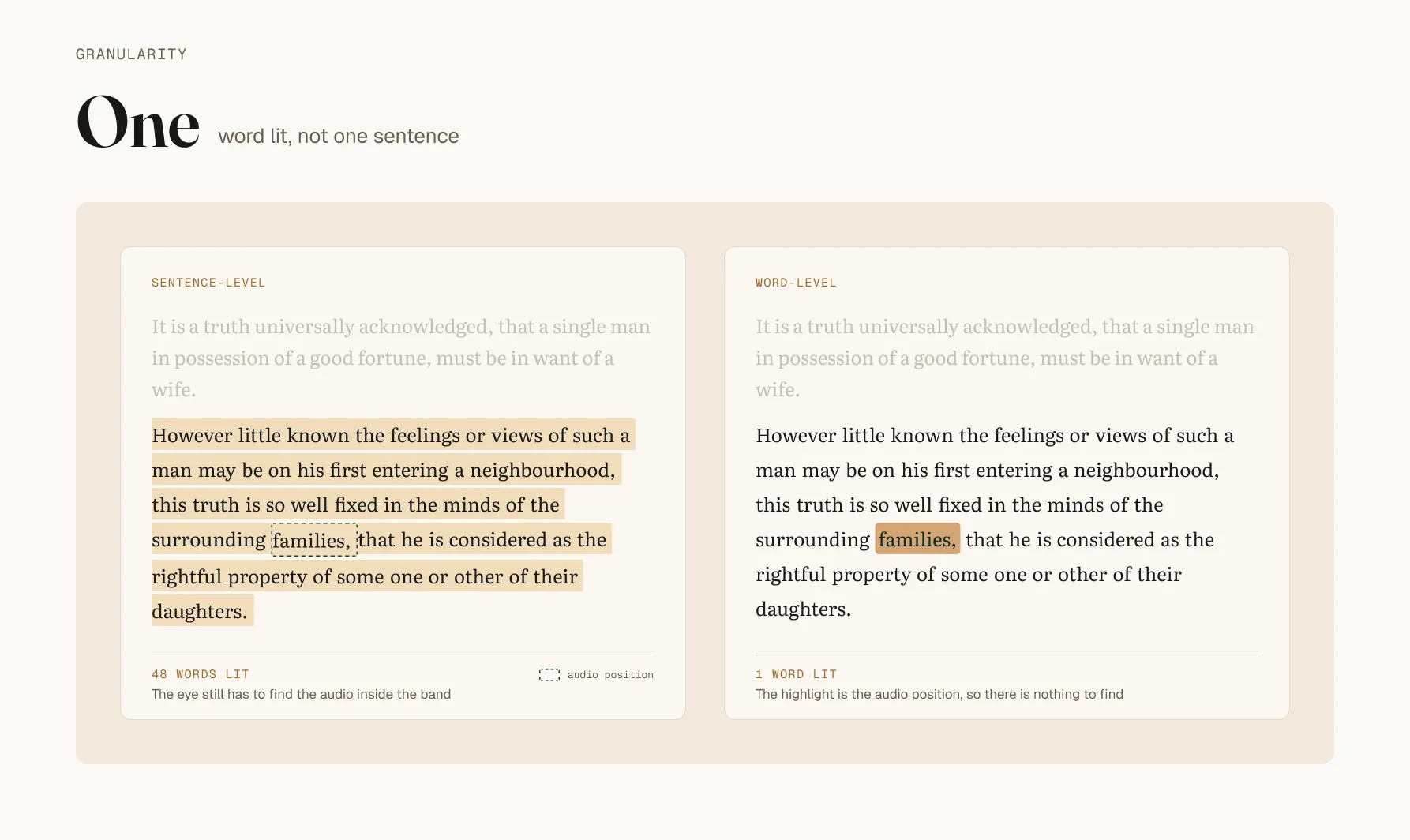
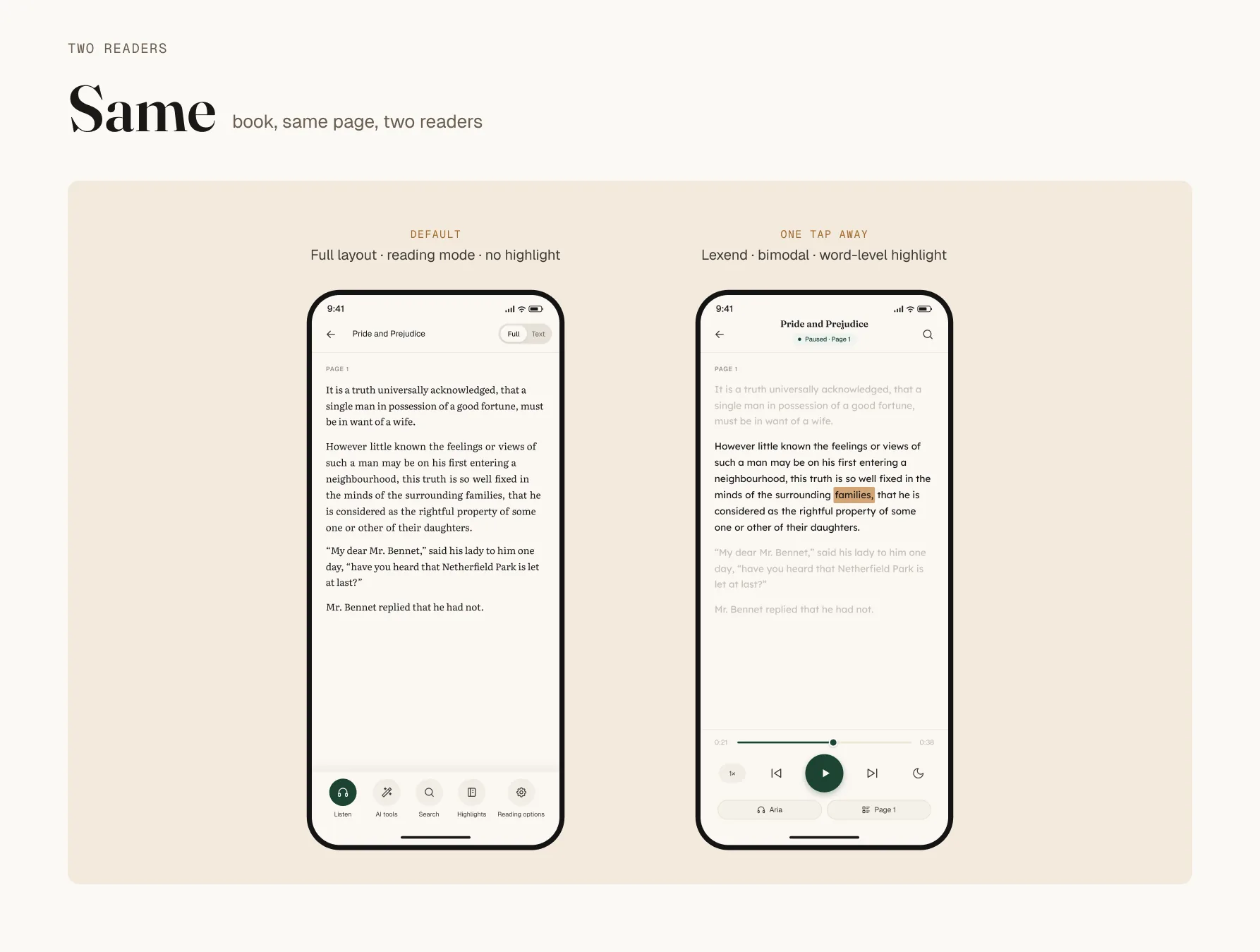
Bimodal mode, where the text highlights word by word as the audio plays, serves both of them. It does two completely different jobs.
Word-level was built for David
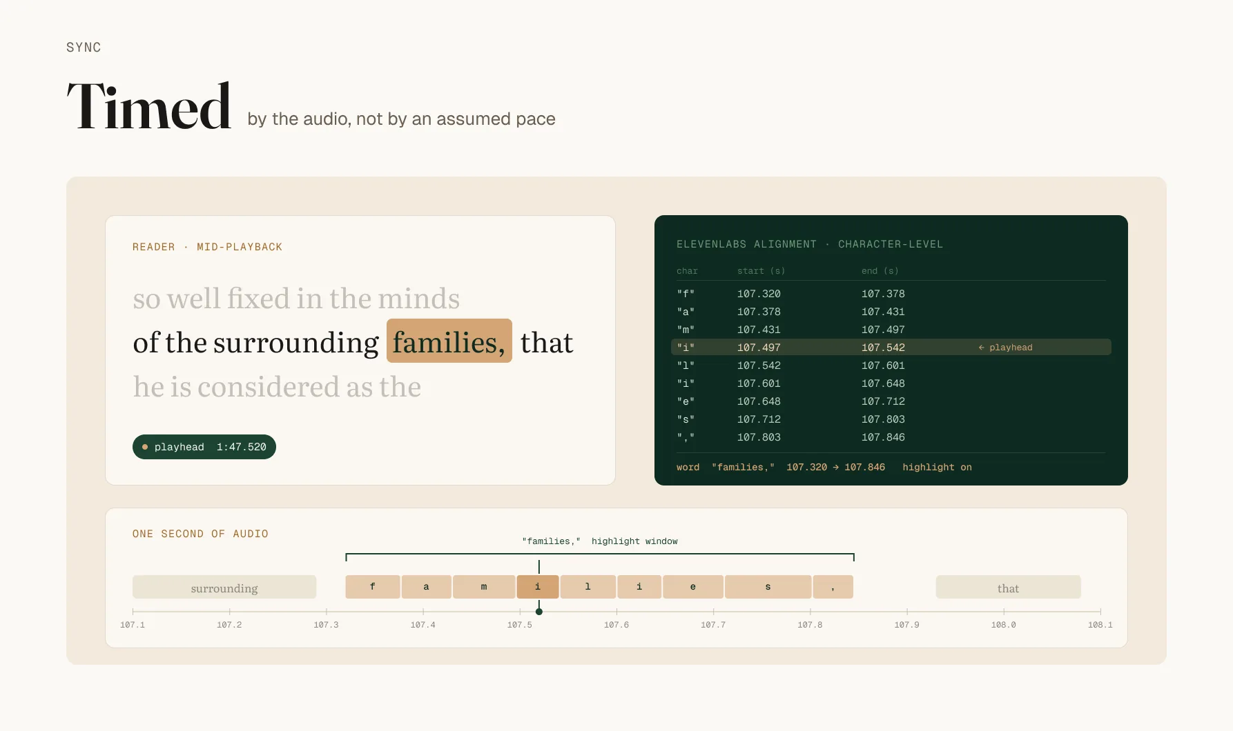
Where it breaks
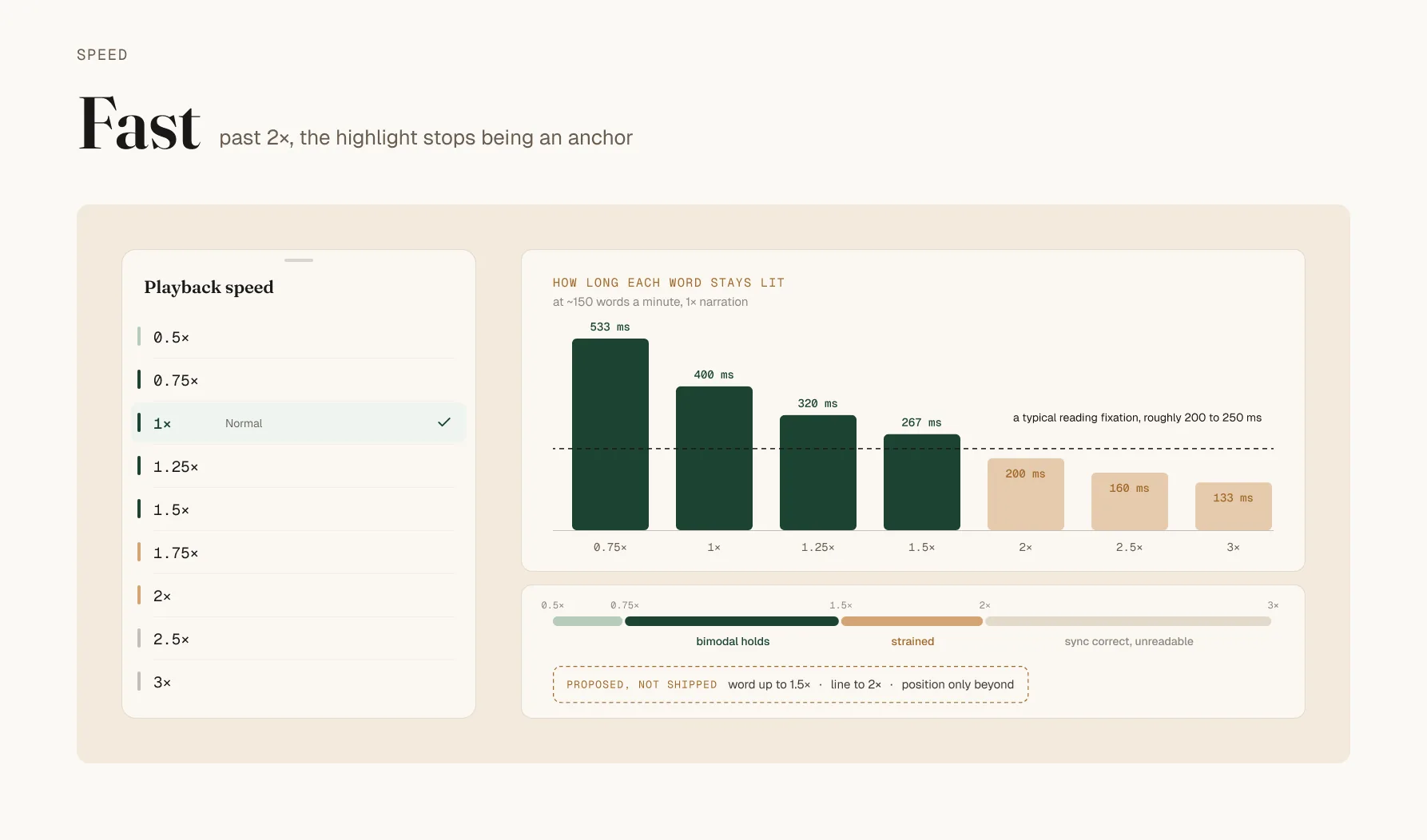
Granularity should change with speed. Past the threshold, word-level should degrade to line highlighting, or drop the highlight and keep only position tracking. A fixed granularity across a 6x range was always going to break at one end. Known, not shipped.
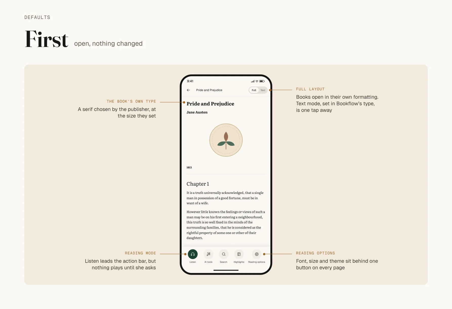
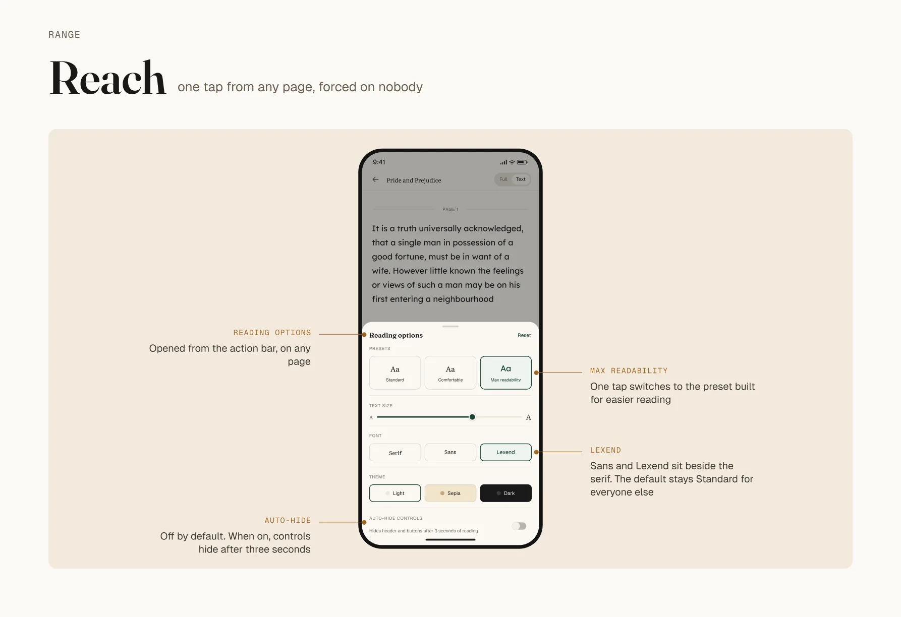
The defaults went to Ama
Built alone
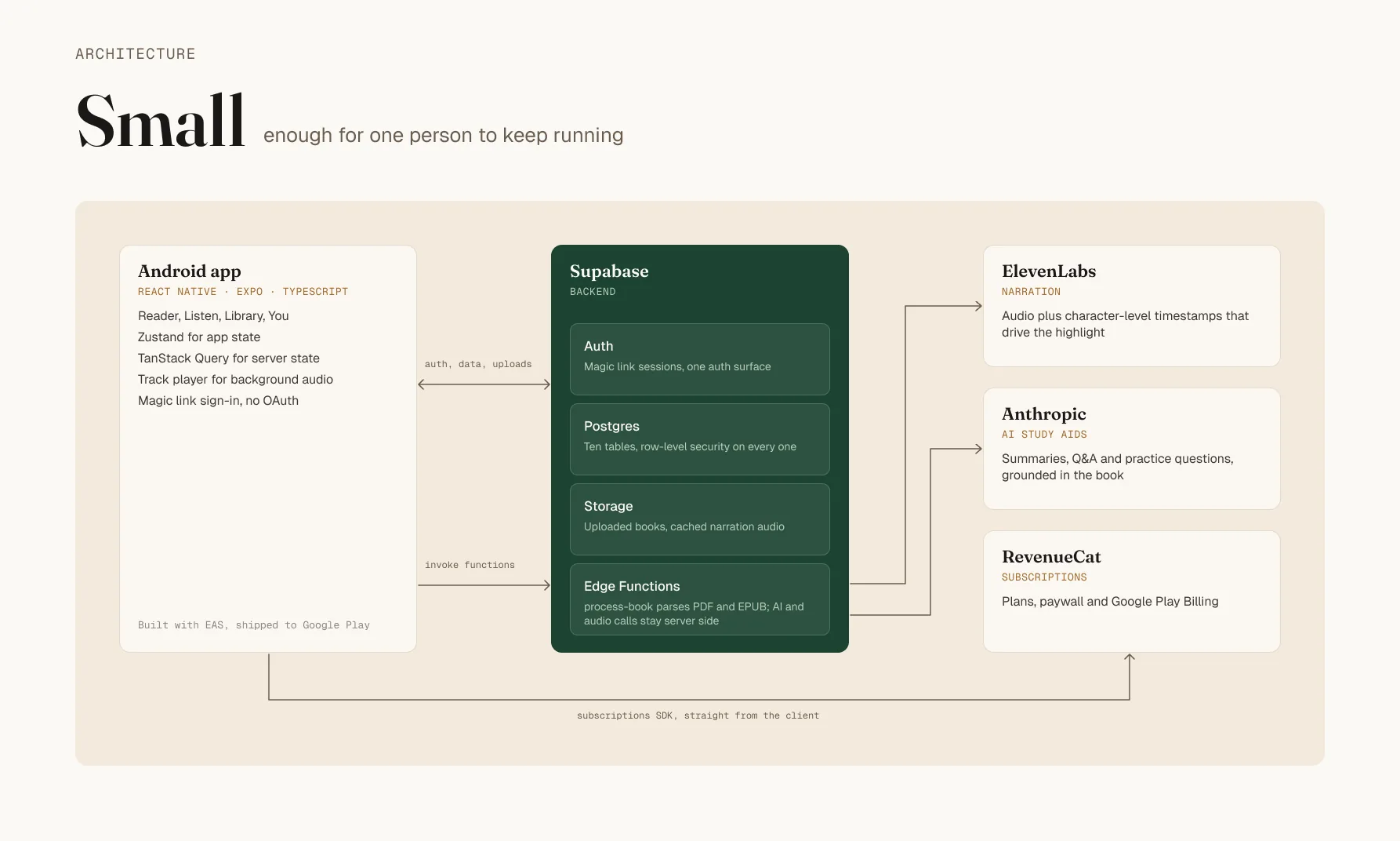
The usual argument against magic link only is that OAuth is what people expect and signup friction costs conversion.
What the testing was, and was not
A paid closed beta. Over twenty testers, recruited and compensated, on real devices, asked for structured feedback on usability, functionality and accessibility.
That is twenty compensated testers, not twenty users. Presenting it as traction is the only thing that could damage this project, and it does not need the help.
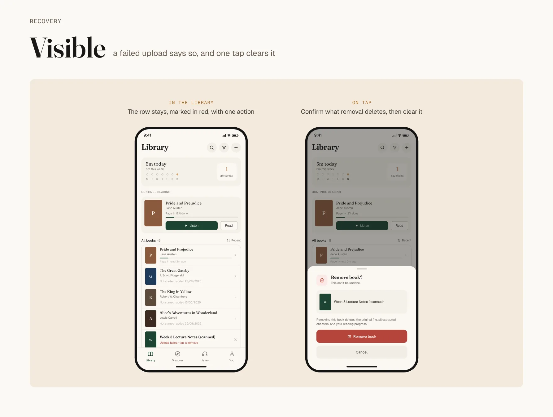
Two findings came back. Some PDFs would not parse, which breaks the core promise at the first thing a new user ever does. And the narration needed to sound more natural, which reads as polish and is not, at least not for David: a synthetic voice adds processing cost to someone already spending effort on decoding. Same fix, cosmetic for one reader and load-bearing for the other.
Both are fixed.
~100
screen states, seven batches, one maintainer
20+
paid beta testers on real devices, not users
200
public domain classics in the library
1
auth surface: magic link only
What is still open
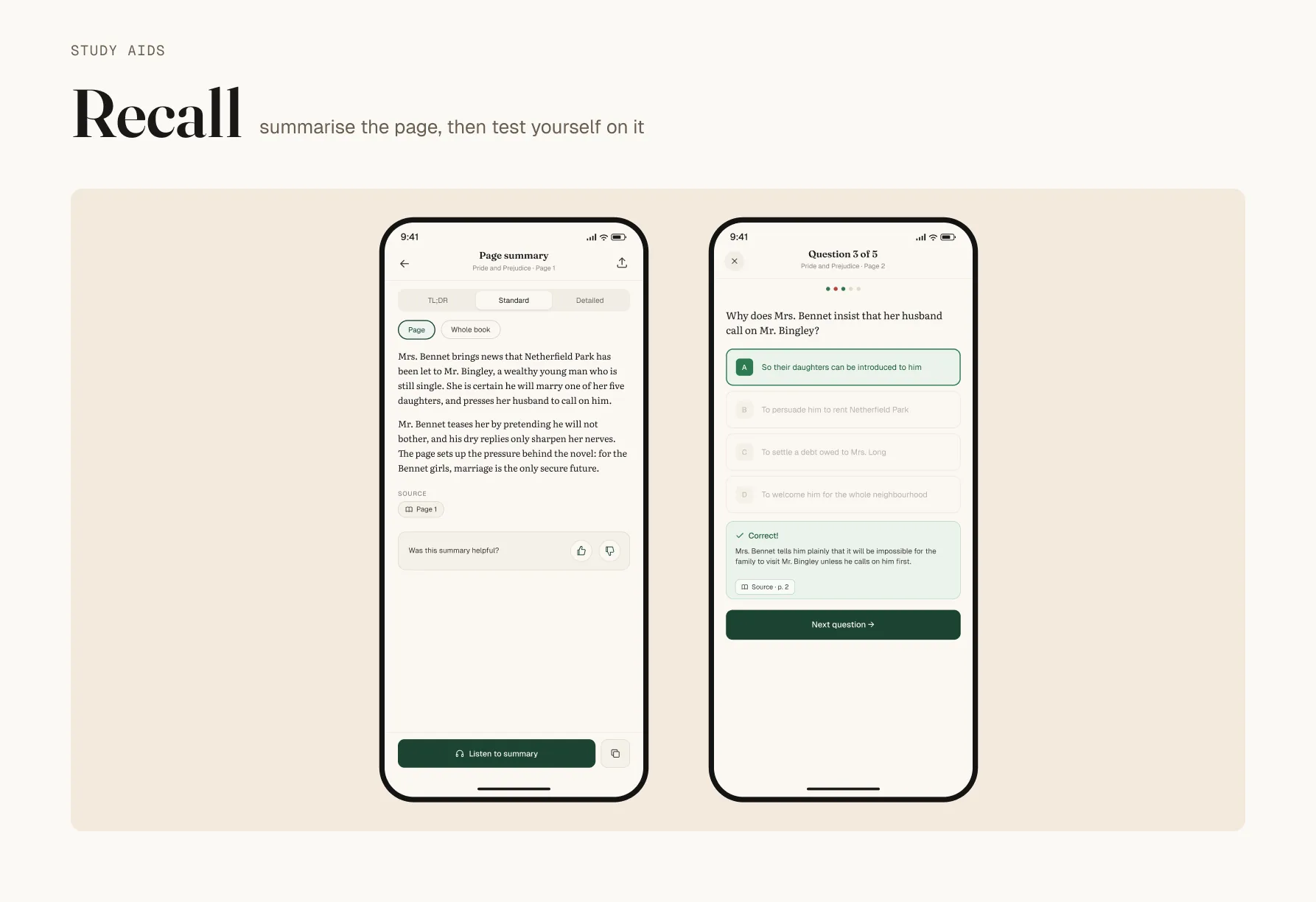
When a summary condenses a chapter Ama is about to be tested on, she cannot see what it left out, and nothing in the interface gives her a reason to doubt it.
Confidence in a summary is not the same as accuracy, and Bookflow does not yet distinguish them.
The sourcing dashboard ran into the same problem with AI procurement recommendations, and the answer there was a confidence score, a plain-language explanation, and an override that takes one action. A summary in Bookflow has none of the three.
Keep reading
 Complete Farmer
A breakpoint is a context, not a property
Foundations to components in Figma. v1.2 in production across 40+ screens.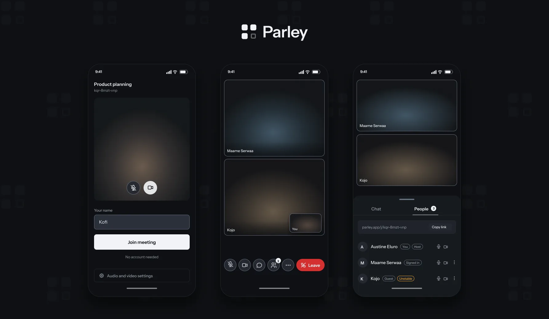 Parley