A breakpoint is a context, not a property

I co-authored Complete Farmer's design system in 2024 and rebuilt it in 2026. The fault that shaped the whole re-architecture was one I had helped ship.


role
Design System Lead
co-authored 2024 · led 2026
timeline
2024 to 2026
re-architected in 2026
scope
84 components
4 products · 4 foundation libraries
status
v1.2 · August 2026
Figma · tokens consumed by engineering

I co-authored Complete Farmer’s design system in 2024 with two other designers. In 2026 I took it over and rebuilt it alone.

Some of what I found was mine.

The Complete Farmer design system cover: the wordmark on a dark green topographic ground, above a line reading
fig 1 · Maintained in Figma, audited with Claude, shipped as tokens to GitHub.

The component that could not be a drawer
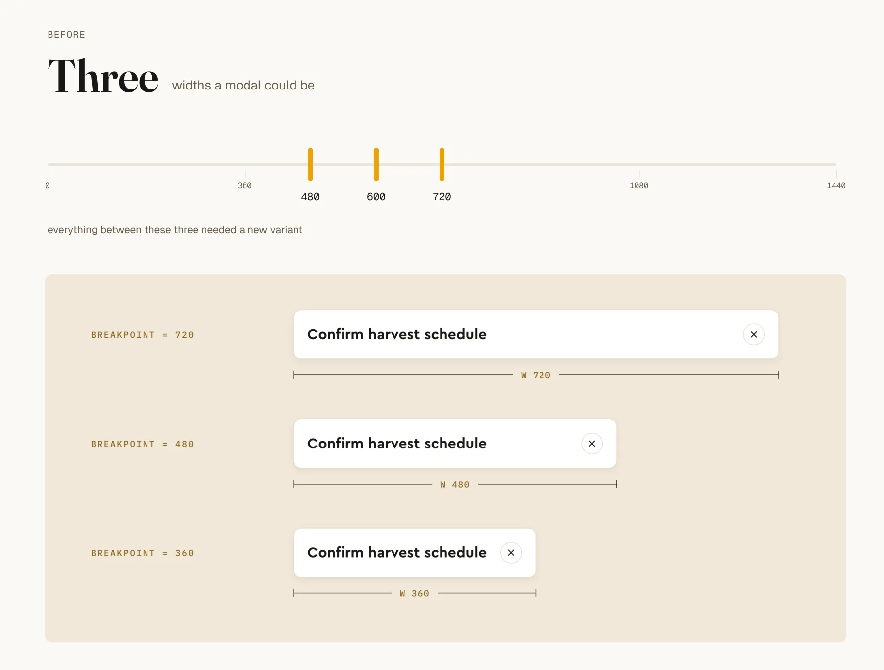
The original Modal header component set, with separate variants for each breakpoint and the title width hardcoded inside each one.
fig 2 · Three variants, one per breakpoint, each with its width written into it. The variant axis was named after pixel values.

The product had three screen sizes, so we built three variants. That was right in 2024 and it held for two years.

What it could not do was express a fourth width. A drawer is a modal at a different width, so a drawer meant another variant and another hardcoded number. Nobody added one. Instead, everyone who needed a drawer built a one-off in their own file.
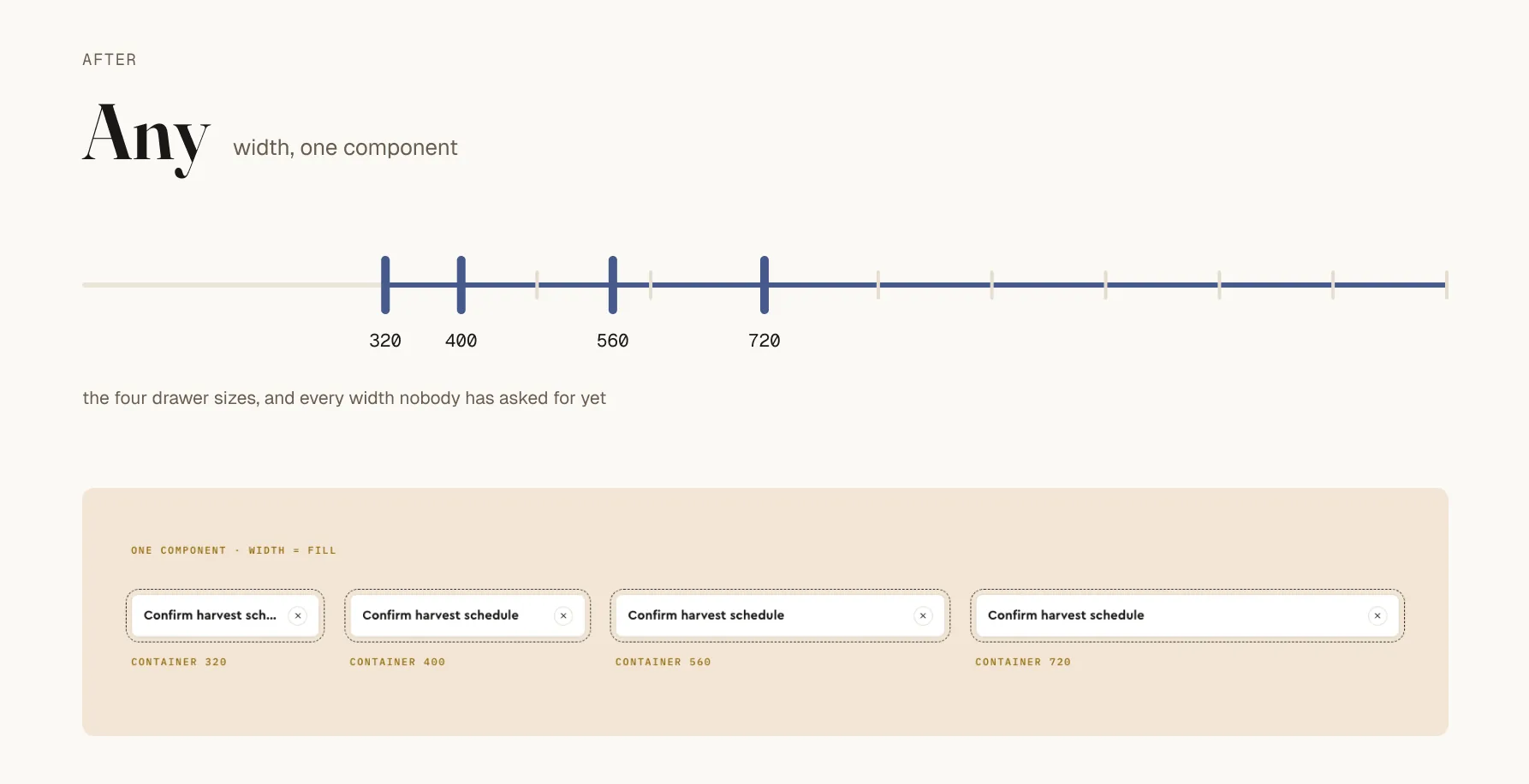
The rebuilt Modal header as a single component, filling containers at 320, 400, 560 and 720 pixels — one component, any width.
fig 3 · These four took an afternoon. They were impossible for two years.

Then I found it three more times

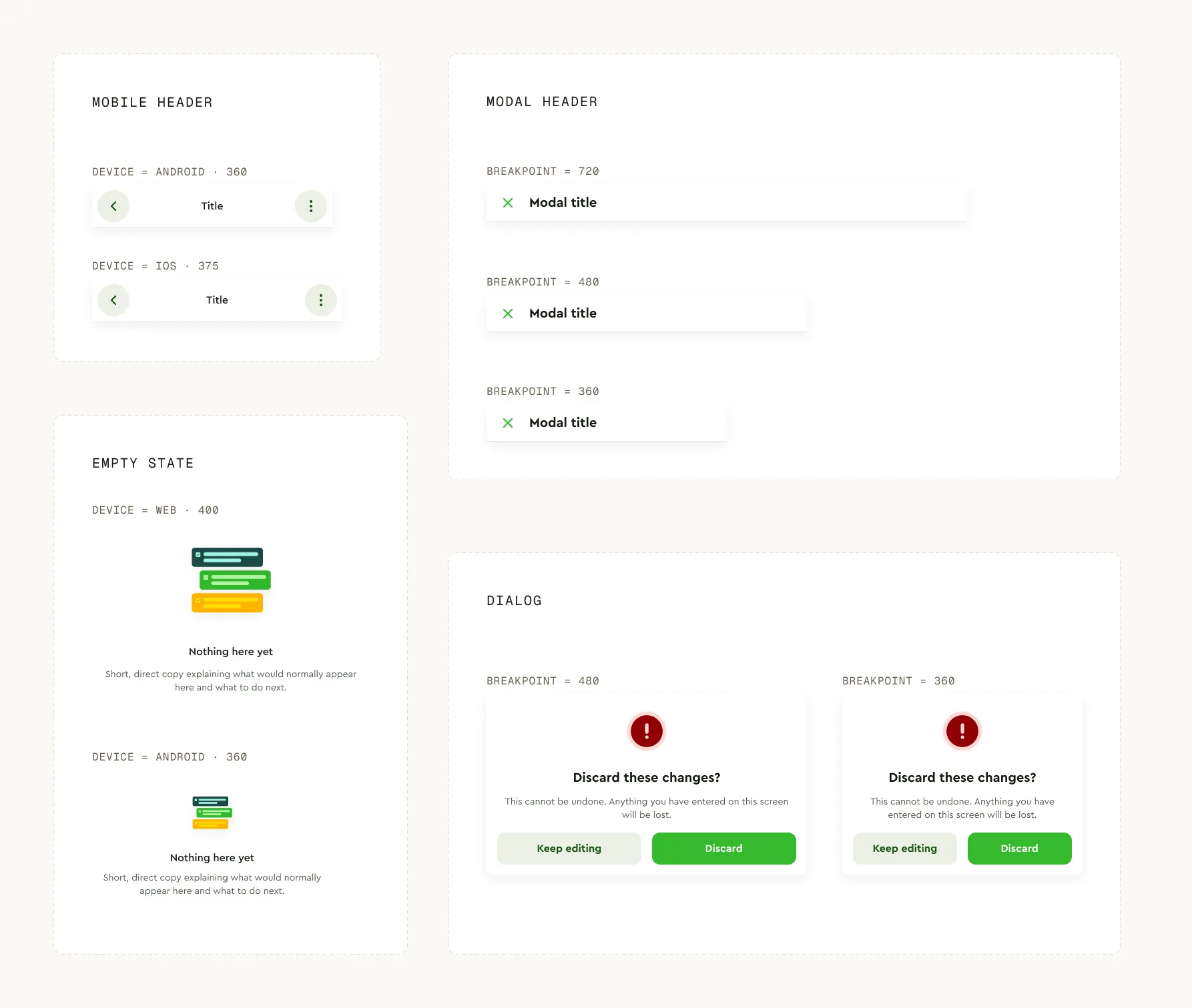
Four component sets side by side, Mobile header, Empty state, Dialog and Modal header, with the breakpoint or Device axis on each one highlighted.
fig 4 · Mobile header had a Device axis that only changed a frame width from 360 to 375. So did Empty state. So did Dialog.

Four components treating a breakpoint as a property of the component rather than a context the component sits in. One instance is a bug. Four is a principle, and it is now written into the system rules.


The numbers said everything was fine
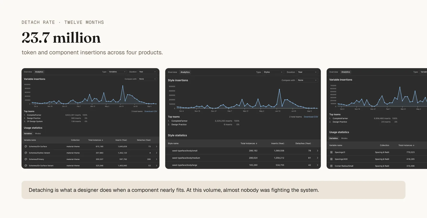
Figma library analytics for the foundation libraries, listing insertions and detaches per token, with detaches consistently under a tenth of a percent of insertions.
fig 5 · 14 detaches against 640,331 insertions. Under a tenth of a percent, right across the foundation.

Detaching is what a designer does when a component nearly fits. At that volume, almost nobody was fighting the system.

But detaching only measures components that exist. Nobody detached a modal to make a drawer. They opened an empty frame. The biggest gap in the system was invisible to the metric that looked healthiest.
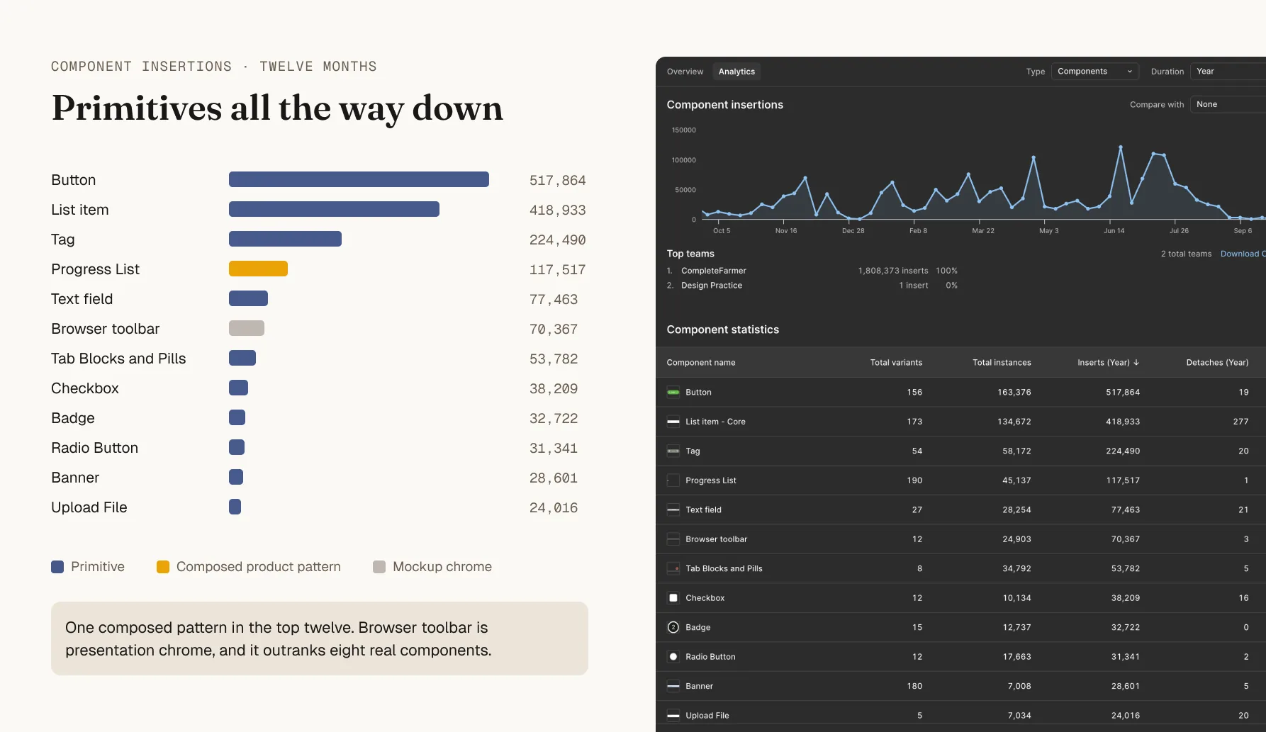
Figma library analytics ranking components by thirty-day insertions, led by List item, Button, Tag, Browser toolbar and Text field, with no composed product pattern near the top.
fig 6 · Primitives all the way down. Browser toolbar is mockup chrome, and it outranks every product pattern in the library.

Two years in, I had built a UI kit. It supplied parts, and every product pattern was being rebuilt per screen.


What was actually wrong

Two years of changes with no changelog. Figma version history records that something was published and when, and never why.

Nobody was careless. The Modal header decision was correct when we made it.

A good decision with no recorded reasoning has no expiry date on it.

Nobody could tell which constraints were still load-bearing and which were simply old.


The rebuild
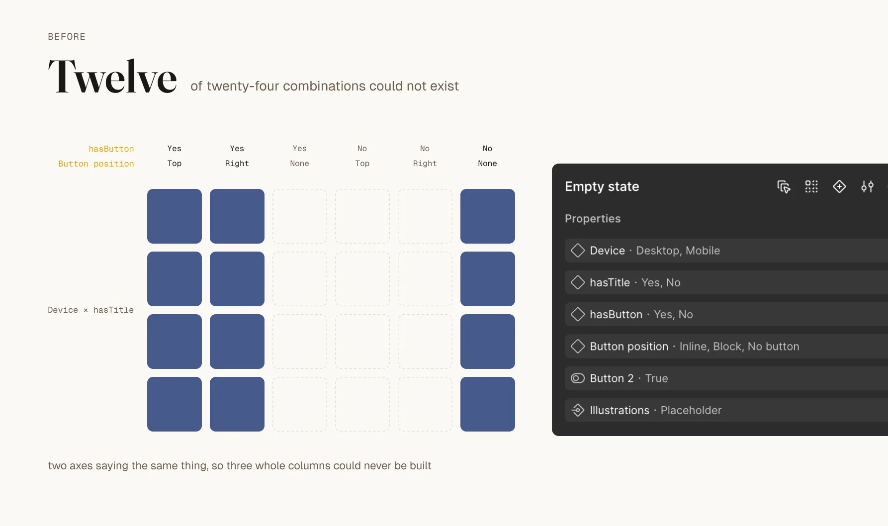
The original Empty state variant grid, with hasButton crossed against Button position, leaving twelve of twenty-four cells empty because those combinations could not exist.
fig 7 · Two axes saying the same thing. Twelve of twenty-four slots were impossible rather than unbuilt.
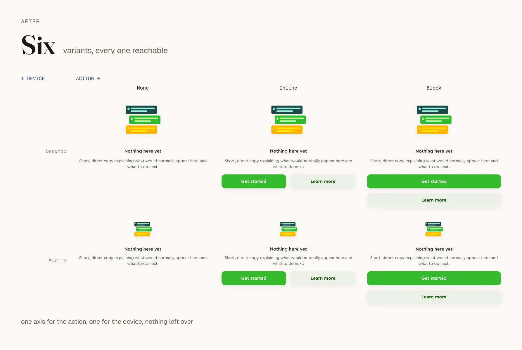
The rebuilt Empty state component with six variants and a single axis for the button.
fig 8 · Six variants, every one of them reachable.
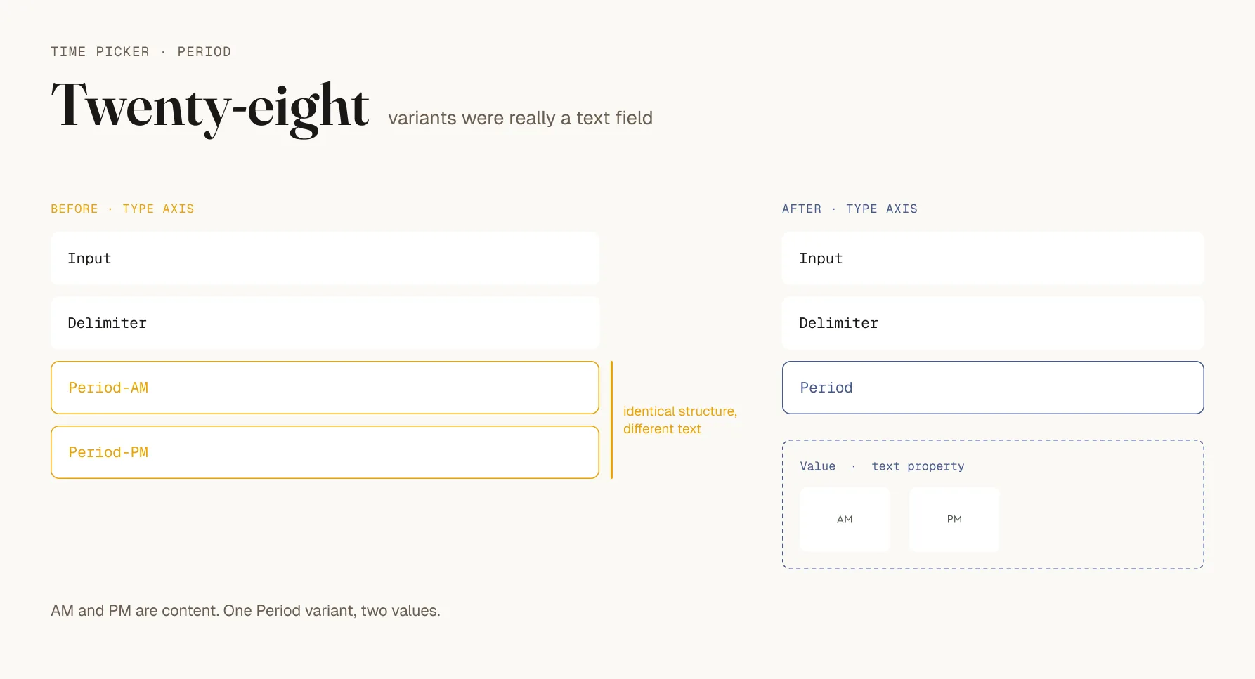
The Time picker component set before and after, with AM and PM shown as values on a Type axis in the old version and as content in the new one.
fig 9 · Period was modelled as structure. AM and PM are content. 64 web variants became 36.
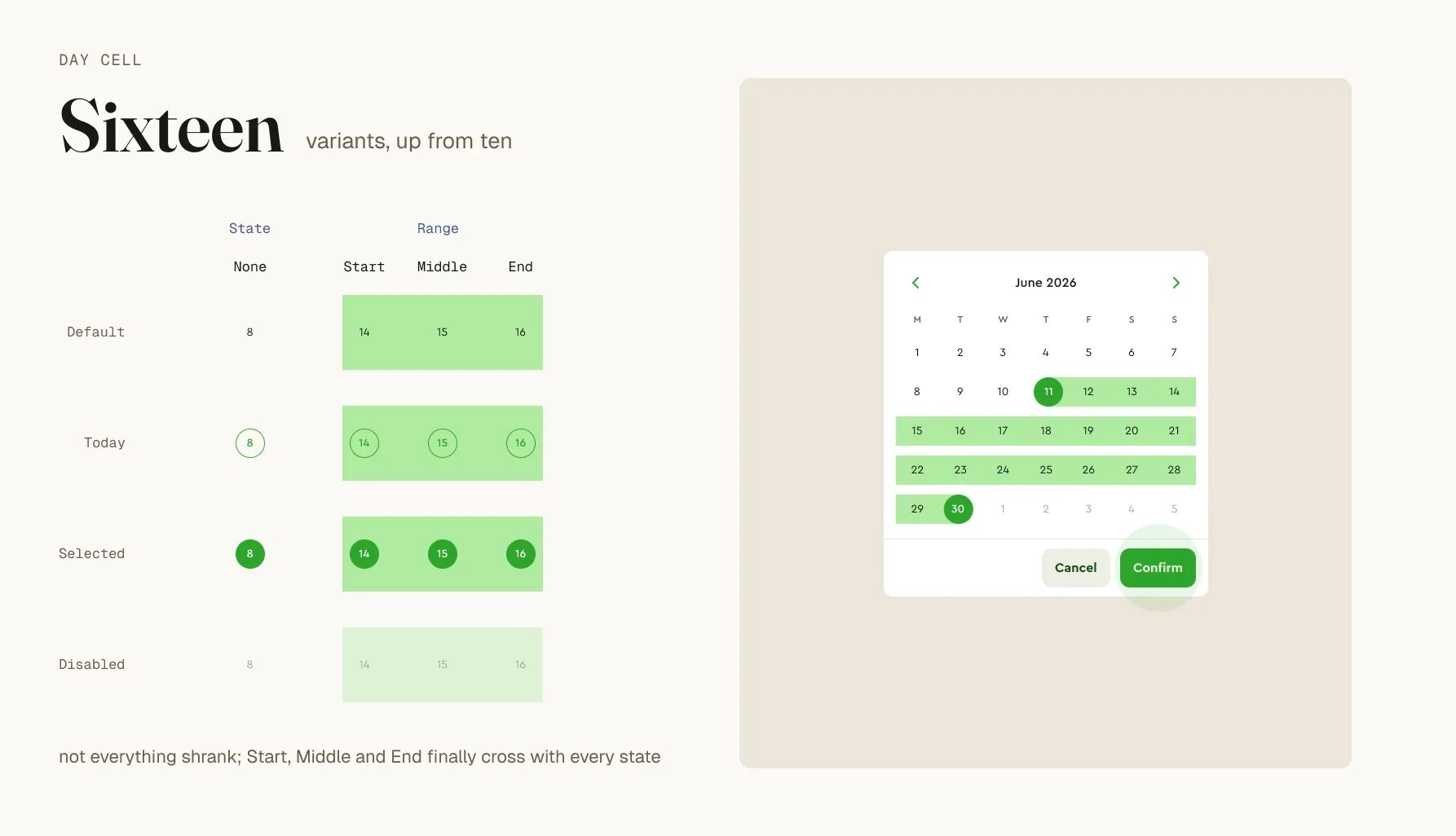
The Day cell component set after the rebuild, playing through a year view, six months and a date selection to show all sixteen built combinations across cleanly crossing axes.
fig 10 · Not everything shrank. Day cell went from ten to sixteen, because the axes finally cross cleanly. This was restructuring, not deletion.
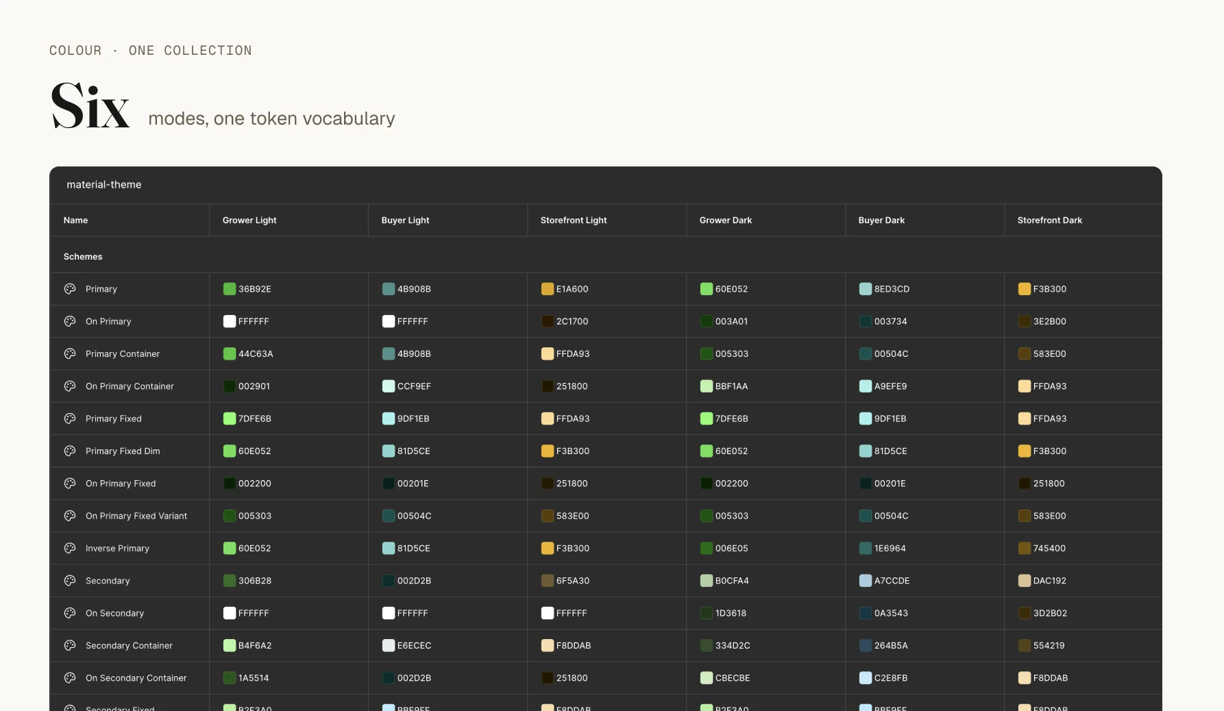
The CF Color variable collection in Figma with six mode columns, three products in light and dark, all resolving from one set of semantic tokens.
fig 11 · Light and dark had been two separate files with the scheme baked into token names, which is how we reached 1,483 colour styles. Now one collection, six modes.
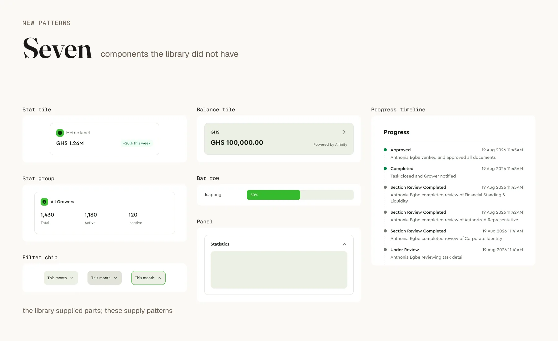
A dashboard composed from the new pattern components: Panel, Stat tile, Stat group, Balance tile, Bar row and Progress timeline.
fig 12 · The step the insertion ranking said had not happened. The system started supplying patterns.

1,483 → 1

colour styles into one collection, six modes

64 → 36

Time picker variants, period modelled as content

0.002%

detach rate across the foundation

84

components across four products


Governance, which had not existed
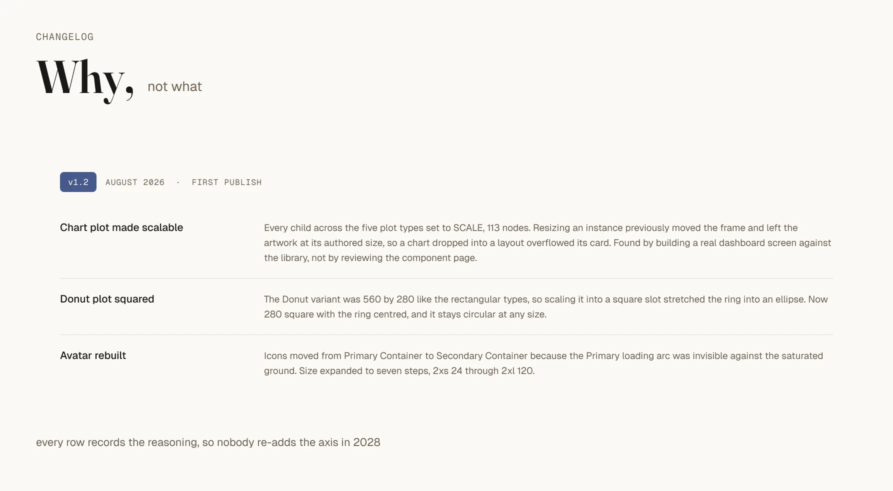
The design system changelog, where each row records the reasoning behind a change alongside the change itself.
fig 13 · Not “Empty state reduced to six variants” but why the axis was redundant, so nobody re-adds it in 2028.
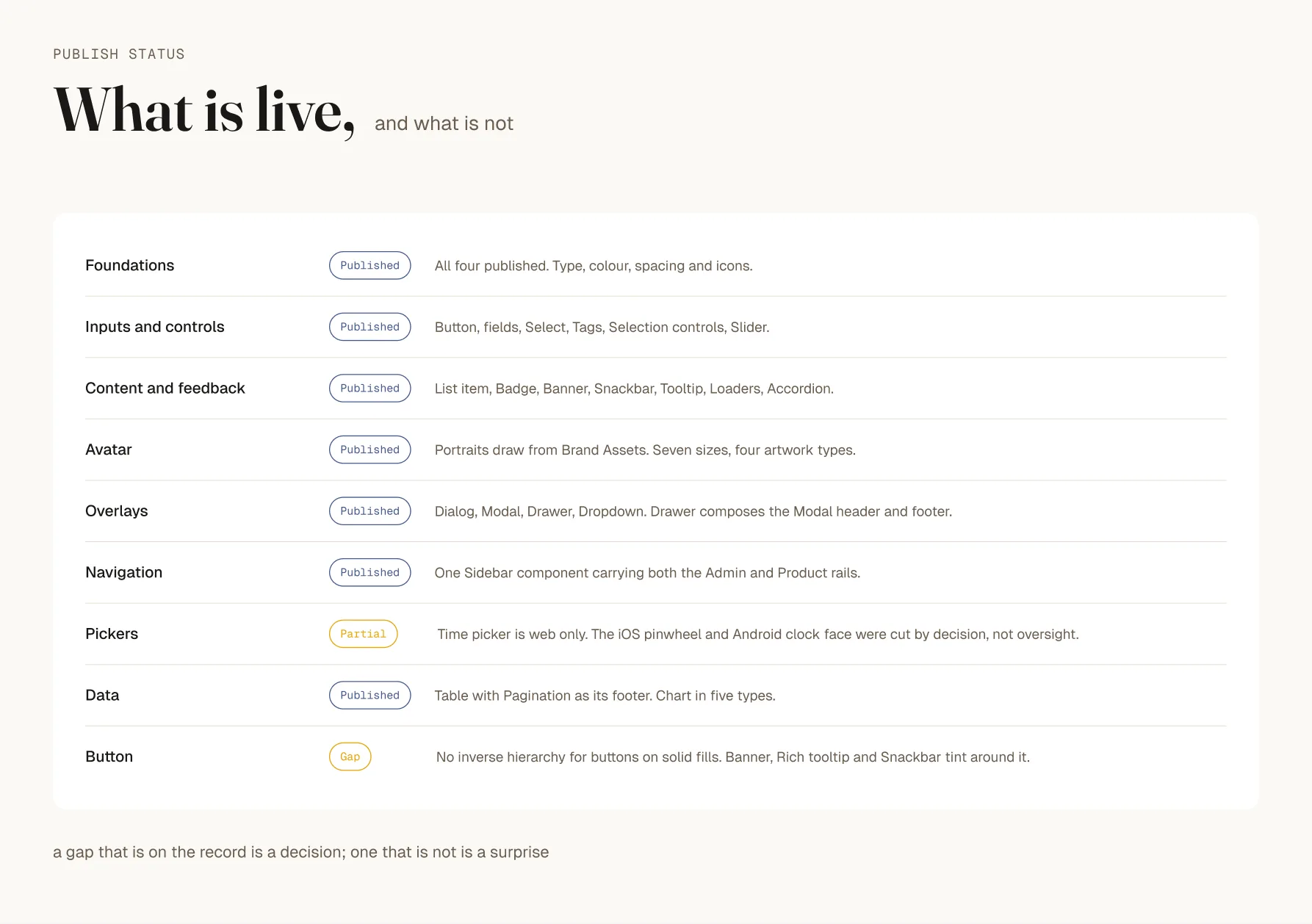
Publish status table listing each component as live, partial or blocked, with a reason recorded beside each status.
fig 14 · What is live, what is partial, what is blocked, and why. Publishing is now limited to two or three people, because it propagates to every file in the organisation.

Marketing asked for bigger buttons on the website. Product asked to skip loading, disabled and error states to ship faster. I said no to both, for different reasons.


What it cost
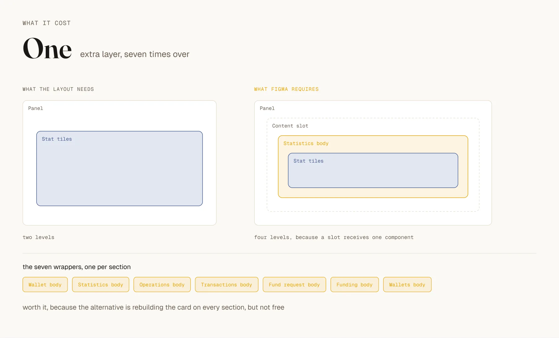
A dashboard layer stack in Figma showing seven wrapper components, each existing only to hold a panel body inside a Figma slot.
fig 15 · Panel uses a Figma slot, and Figma will not allow arbitrary layers inside an instance. So every panel body needs its own component. On this dashboard that is seven wrappers that exist only to satisfy the mechanism.

Time picker ships web only. The iOS pinwheel and Android clock face were cut.

And during the rebuild I republished eight or nine times in a few days, several of them correcting the one before. Workable with one maintainer. Not workable with teams depending on the output, which is exactly why there is now a separate work-in-progress space.


Too early to say it worked

v1.2 published in August and migrated into the organisation in September. Six weeks is not evidence, and any number I put here now would be noise.

What I am watching at the first checkpoint: whether the new pattern components get used at all, whether the detach rate holds as the component layer takes more load, whether anyone actually selects the Buyer and Storefront themes, and whether every publish has a changelog row behind it.

If the new patterns read zero after a month, I built them for one dashboard rather than for the system. I would rather find that out early than defend them later.


What I would tell whoever inherits this next

Adoption tells you how people use what exists. It tells you nothing about what they stopped asking for.

Read the components nobody built before you read the ones they did. And record why, not what. The why is the only part that expires.